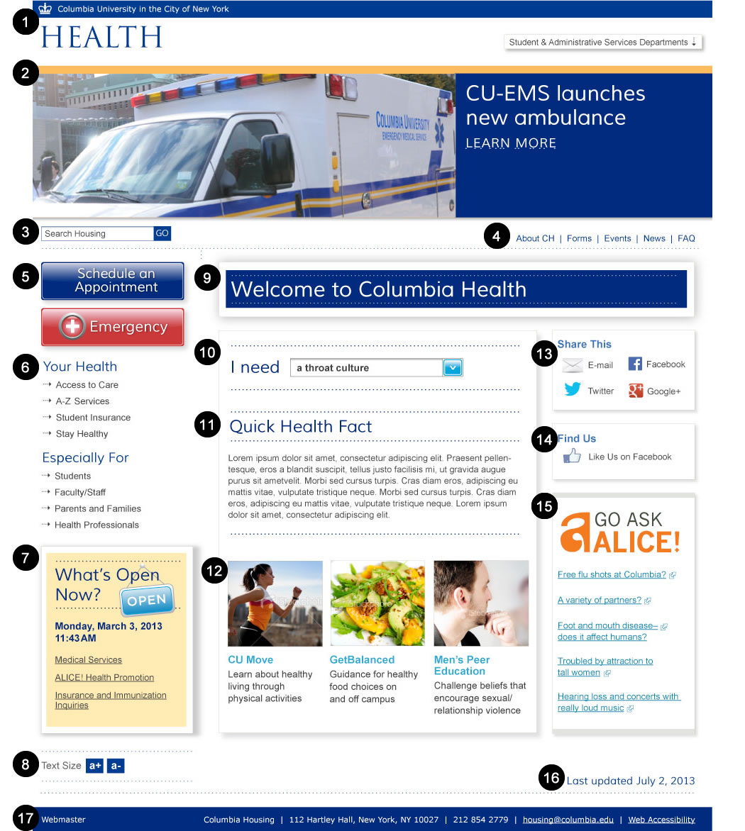
| ID |
WCAG |
Recommendations |
| 01.01 |
2.4.1
1.3.1
4.1.2
1.4.5
1.4.3
2.4.7
|
- Bypass Blocks
- Provide a skip to main content link as the very first element on the page. The skip link should either be visible at all times or become visible on focus. This element needs to work for both screen reader users and keyboard only users.
- Overall Structure
- The header of the page should be built using a <header> element for mark up.
- The "Health" text should be marked up using a simple paragraph or div element, not a heading element.
- Name, Role Value
- A landmark role of banner should be added to the header element.
- No Images of Text
(Creative)
- The only text that should be imbedded in images is "logotext". Use true text for all text (except logotext) on the page.
- Color Contrast
(Creative)
- The grey text (#969696) on the white background only has a color contrast ratio of 3.0 to 1. The color contrast lumonisity ration between the font color and the background color needs to be at least 4.5 to 1 for text. The exception is for large text (18 point or 14 point bold) to only be required to have a color contrast ratio of 3 to 1. Color contrast for this comp was determined by taking a pixel color sample from the font and from the background. As designers are picking colors, consider using these tools to test color contrast http://snook.ca/technical/colour_contrast/colour.html and http://contrast-a.dasplankton.com/
- Focus Visible
- Visual focus must be evident on any element that you can tab to (like links and form controls). Test by tabbing through the page and confirm that you can visually tell where the focus is each time you tab.
|
| 01.02 |
1.4.5
1.1.1
|
- No Images of Text
(Creative)
- The text "CU-EMS launches new ambulance learn more" should be true text (and not text embedded in an image).
- Decorative Image
- The image of the ambulance should have null alt text because it is only decorative.
- A single <a href> for this news story should be wrapped around the image and the true text.
|
| 01.03 |
3.3.2
4.1.2
|
- Labels
- Make sure a label is explicitly associated with the search field, using the for and id attributes.
- Name, Role, Value
- A landmark role of search should be added to the div that surrounds this search form.
|
| 01.04 |
1.3.1
4.1.2
|
- Lists
- The menu (that begins with 'About CH | Forms | Events | ...') should be built using an unordered list for mark up and wrapped into a nav element.
- Name, Role, Value
- A landmark role of navigation should be added to the nav element.
|
| 01.05 |
4.1.2
1.4.3 |
- Name, Role, Value
- For the "Schedule an Appointment" link button and the "Emergency" link button, use the role="button". For example: <a href="foo.html" role="button">Schedule an Appointment</a>
- Color Contrast (Creative)
- The white text on the red background (#D04E46) only has a color contrast of 4.3 to 1. The color contrast lumonisity ration between the font color and the background color needs to be at least 4.5 to 1 for text. The exception is that large text (18 point or 14 point bold) is only required to have a color constrat ratio of 3 to 1.
|
| 01.06 |
1.3.1
1.3.1 1.1.1
4.1.2
|
- Section Headings
- The "Your Health" element and the "Especially For" element should be marked up in as a second level heading for the page (h2).
- Lists
- Each menu (one begins with 'Access to Care, Services...' the other begins with "Students, Faculty/Staff...") should be built using an unordered list for mark up. Both lists should be wrapped into a single nav element.
- Decorative Images
- The arrow icons to the left of these menu links should be integrated through CSS, or if clickable as part of the link, the img element must have an empty alt atribute (alt=""). If the icon is integrated in HTML and clickable, then it must be part of the same link.
- Name, Role, Value
- A landmark role of navigation should be added to the nav element.
|
| 01.07 |
1.3.1
1.3.1
1.4.3
|
- Section Headings
- The "What's Open Now" element should be marked up in as a second level heading for the page (h2).
- Lists
- The list of services should be built using an unordered list for mark up.
- Color Contrast
(Creative)
- The brown text (#826B4B) on the yellow background (#F9E3A9) only has a color contrast of 4 to 1. The color contrast lumonisity ration between the font color and the background color needs to be at least 4.5 to 1 for text. The exception is that large text (18 point or 14 point bold) is only required to have a color constrat ratio of 3 to 1.
|
| 01.08 |
1.1.1 |
- Active Images
- Make sure the alt text for the two active images (in the Text Size area) clearly describes their function. For example, the "a+" image alt could be "increase font size" and the "a-" image alt could be "decrease font size"
|
| 01.09 |
1.3.1 4.1.2 |
- Section Headings
- The "Welcome to Columbia Health" text should be marked up as the first level heading for the page (H1).
- Name, Role, Value
- A landmark role of main should be added to the div that contains the main content of the page.
|
| 01.10 |
3.3.2
3.2.1
2.1.1
4.1.2 |
- Labels
- Make sure the "I need" text is marked up using a label element and use the for and id attributes to explicitly associate it with the select drop down menu.
- On Input
- Inform users about what will happen when an option is chosen from this drop down menu, or add a "go" button like the one located after the search (to allow screen reader users complete control over this option).
- Keyboard
/ Name, Role, Value
- "Faux" form controls are often very difficult for accessibility because their roles and names are not always conveyed to screen readers and other assistive technologies. If the select is built with CSS and JavaScript instead of using a real select element (much more likely to be accessible), make sure it is fully operable and compatible with keyboards and assistive technologies.
|
| 01.11 |
1.3.1 |
- Section Headings
- The "Quick Health Fact" text should be marked up as a second level heading for the page (H2).
|
| 01.12 |
1.1.1 1.3.1 1.4.3 |
- Decorative Image
- The images for each news story should have null alt text because they are only decorative.
- A single <a href> for each news story should be wrapped around the image and the link text.
- Lists
- The list of news stories should be built using an unordered list for mark up.
- Color Contrast (Creative)
- The aqua text (#50ACDC) on the white background only has a color contrast ratio of 2.5 to 1. The color contrast lumonisity ration between the font color and the background color needs to be at least 4.5 to 1 for text. The exception is for large text (18 point or 14 point bold) to only be required to have a color contrast ratio of 3 to 1.
|
| 01.13 |
1.3.1 1.3.1 1.1.1 |
- Section Headings
- "Share This" should be marked up as a second level heading for the page (H2).
- Lists
- The social media links should be built using an unordered list.
- Decorative Images
- The icons to the left of the links should be integrated through CSS, or if clickable as part of the link, the img element must have an empty alt atribute (alt=""). If the icon is integrated in HTML and clickable, then it must be part of the same link.
|
| 01.14 |
1.3.1 1.1.1 |
- Section Headings
- "Find Us" should be marked up as a second level heading for the page (H2).
- Decorative Images
- The icon to the left of the "Like Us on Facebook" link should be integrated through CSS, or if clickable as part of the link, the img element must have an empty alt atribute (alt=""). If the icon is integrated in HTML and clickable, then it must be part of the same link.
|
| 01.15 |
1.3.1 1.4.3 1.3.1 1.1.1 |
- Section Headings
- "Go Ask Alice" should be marked up as a second level heading for the page (H2).
- Color Contrast
(Creative)
- The aqua text (#62B1C8) on the white background only has a color contrast ratio of 2.4 to 1. The color contrast lumonisity ration between the font color and the background color needs to be at least 4.5 to 1 for text. The exception is for large text (18 point or 14 point bold) to only be required to have a color contrast ratio of 3 to 1.
- The orange text (#ED7D24) on the white background only has a color contrast ratio of 2.8 to 1.
- Lists
- The list of questions should be built using an unordered list for mark up.
- Informative Images
- The icon that follows each question link needs to be part of each link, so the text alternative announcing the opening of a new window can be read as part of each link. If integrated as CSS, then the text equivalents could be hidden off-screen, but still announced as part of those links.
|
| 01.16 |
1.3.1 |
- Overall Structure
- The "Last updated" information should be inside the footer element. It can visually be displayed as shown in the mock-up but for screen reader users it should be found in the source code inside <footer></footer>
|
| 01.17 |
1.3.1 4.1.2 |
- Overall Structure
- The footer of the page should be built using a footer element for mark up.
- Name, Role, Value
- A landmark role of contentinfo should be added to the footer element.
|